Say that one day you’re faced with a table of distance information between a bunch of points. Just looking at the table doesn’t really provide any real information about the underlying structure of the data, so you want to find a way to visualize this in a way that’s more meaningful.
For instance take a look of this table of distances between US cities:
| Atlanta | Chicago | Denver | Houston | Los Angeles | Miami | New York | San Francisco | Seattle | Washington, DC | |
|---|---|---|---|---|---|---|---|---|---|---|
| Atlanta | 0 | 587 | 1212 | 701 | 1936 | 604 | 748 | 2139 | 2182 | 543 |
| Chicago | 587 | 0 | 920 | 940 | 1745 | 1188 | 713 | 1858 | 1737 | 597 |
| Denver | 1212 | 920 | 0 | 879 | 831 | 1726 | 1631 | 949 | 1021 | 1494 |
| Houston | 701 | 940 | 879 | 0 | 1374 | 968 | 1420 | 1645 | 1891 | 1220 |
| Los Angeles | 1936 | 1745 | 831 | 1374 | 0 | 2339 | 2451 | 347 | 959 | 2300 |
| Miami | 604 | 1188 | 1726 | 968 | 2339 | 0 | 1092 | 2594 | 2734 | 923 |
| New York | 748 | 713 | 1631 | 1420 | 2451 | 1092 | 0 | 2571 | 2408 | 205 |
| San Francisco | 2139 | 1858 | 949 | 1645 | 347 | 2594 | 2571 | 0 | 678 | 2442 |
| Seattle | 2182 | 1737 | 1021 | 1891 | 959 | 2734 | 2408 | 678 | 0 | 2329 |
| Washington, DC | 543 | 597 | 1494 | 1220 | 2300 | 923 | 205 | 2442 | 2329 | 0 |
While packed full of information, this doesn’t really provide any context for the exact relations between these cities. A much more useful visualization would be a map of these points.
The challenge then is to produce coordinates for each item that best approximate the distances in the table. This type of problem is well solved by a set of techniques called Multidimensional Scaling (MDS). There is a good overview of MDS variants on the page where I stole this example from, but we only really need the classic version here. In this case, we just choose coordinates for each item such that they minimize the squared error between euclidean distances of the coordinates themselves and the entries in the distance matrix.
Finding these coordinates is actually a fairly simple calculation: you just square each value in the distance matrix, double centre that such that the columns and rows both have a zero mean, and then take the SVD of that matrix. The point coordinates are then in the factors returned by the SVD. A full derivation of this algorithm can be found here for anybody that’s interested in why this works.
Displaying the output of this algorithm using D3.js, and a relatively sane looking output appears:
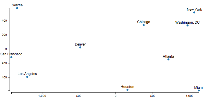
Obviously, the axes point in the opposite direction than normal in this diagram, which is because I cheated a little to get the output look a little more familiar. The raw distance matrix doesn’t encode orientation information, so this process produced a set of coordinates that are the mirror image and rotated to what we’re used to. However, the relative distances between all the cities here are almost exactly correct, which is the goal here.
In javascript using numeric.js, the code to produce these coordinates is fairly concise:
/// given a matrix of distances between some points, returns the
/// point coordinates that best approximate the distances
mds.classic = function(distances, dimensions) {
    dimensions = dimensions || 2;

    // square distances
    var M = numeric.mul(-.5, numeric.pow(distances, 2));

    // double centre the rows/columns
    function mean(A) { return numeric.div(numeric.add.apply(null, A), A.length); }
    var rowMeans = mean(M),
        colMeans = mean(numeric.transpose(M)),
        totalMean = mean(rowMeans);

    for (var i = 0; i < M.length; ++i) {
        for (var j =0; j < M[0].length; ++j) {
            M[i][j] += totalMean - rowMeans[i] - colMeans[j];
        }
    }

    // take the SVD of the double centred matrix, and return the
    // points from it
    var ret = numeric.svd(M),
        eigenValues = numeric.sqrt(ret.S);
    return ret.U.map(function(row) {
        return numeric.mul(row, eigenValues).splice(0, dimensions);
    });
};
Applications to laying out Venn Diagrams
I first stumbled across this family of algorithms a couple of weeks ago when I was reading a paper by Leland Wilkinson for my post on laying out area proportional venn diagrams. We both had taken the approach of generating an initial layout for the venn diagrams, and then optimizing that layout. While I just came up with a simple greedy approach to generate the initial layout, he used MDS instead.
While my greedy approach usually worked really well, there was one example in the Wilkinson paper where his approach was clearly superior:
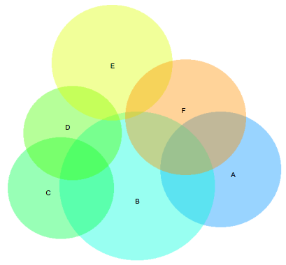
Aside from the ‘B’ and ‘E’ sets overlapping slightly here when they should be disjoint, this diagram is basically perfect. The greedy version here is fairly flawed in comparison - with the E set dangling off and not connecting to the D set at all:
Note: you need Javascript enabled and a SVG compatible browser to view the venn diagrams below
The problem here is the E set is the last set laid out by the greedy layout, since it has the least amount of overlap of any set in the diagram. While it overlaps the D and F sets, they have been placed too far apart for this set to bridge that gap, creating a layout with a local minima that the local optimization technique I used couldn’t step out of.
By calculating the appropriate euclidean distance between each pair of sets numerically, and then passing that distance matrix to the MDS algorithm above, we get a layout that can be optimized to a much better solution:
Its worth pointing out the Wilkinson paper uses MDS on the Jaccard distance between the sets, rather than Euclidean distance I used here. This doesn’t seem to change the results though, both approaches lead to a very similar diagram.
Conclusion
I’ve put my javascript version up on github, and I’ve also updated the venn.js code to optionally use this as an initial layout.
I was about to use MDS by default for the venn.js library, but the greedy layout seems to do a better job on most other examples I tried. The problem seems to be that MDS spends an equal amount of effort trying to get the distances right for small intersection areas, whereas the greedy layout only looks at the largest intersections. Even in the example above the greedy version actually produces a diagram with a much lower loss, it just doesn’t optimize as well as the MDS version.
Other MDS variants might overcome this problem though. I looked at using a weighted MDS calculation, with a vague notion of using the size of the set intersections as the weights to use. Unfortunately, all the information I could find about WMDS online was only talking about weighting the rows of the matrix rather than the entries - and the primary research is behind an academic paywall. Next time I’m near a university library I probably see about getting it, but I’m stopping here in the meantime.
While it didn’t really solve my specific problem as well as I would have liked, its still a cool algorithm.
Last updated on 29 June 2015
Get new posts by email!
Enter your email address to get an email whenever I write a new post: